How to Design a High-End Dog Salon Website
When pet owners search for a groomer, they’re not just comparing services, they’re deciding who they trust with their dog. That decision happens fast, often within seconds of landing on a website.
This concept was designed around a simple idea: A pet owner should feel calm, confident, and slightly impressed within the first 5 seconds.
Because that’s exactly how they want to feel when handing over their dog.
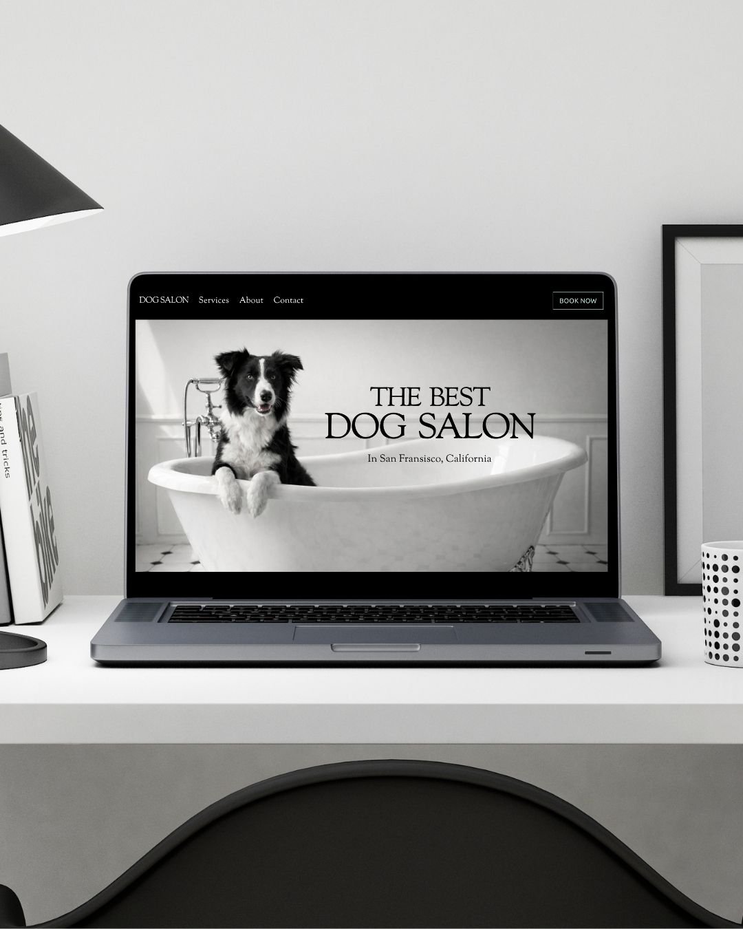
The First Seconds Matter the Most
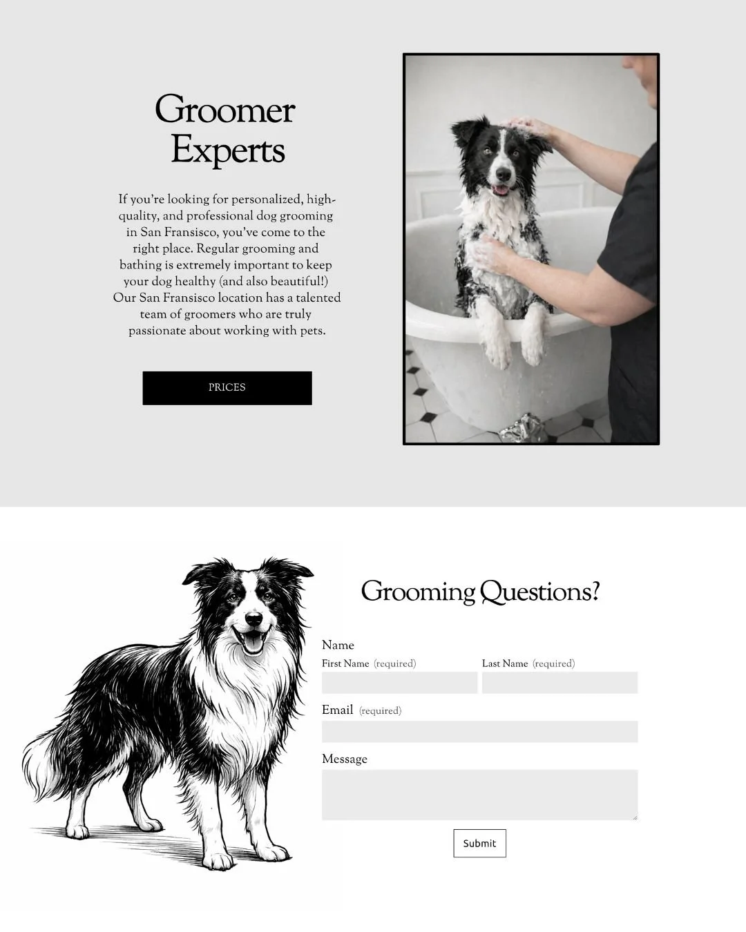
The hero section isn’t just a nice image, it sets the emotional tone.
A calm dog in a freestanding tub
Soft, monochrome color grading
Minimal text with strong typography
No clutter. No noise. No trying too hard.
It immediately communicates:
Clean environment
Professional care
A premium experience
That combination is what separates a $40 groomer from a $120 groomer, before pricing is even mentioned.
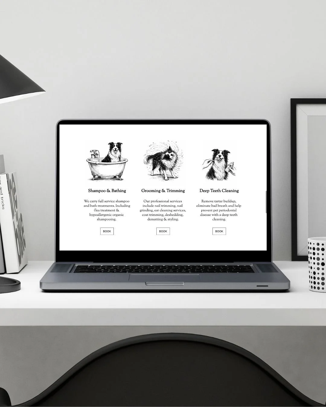
Simple Services Win (Every Time)
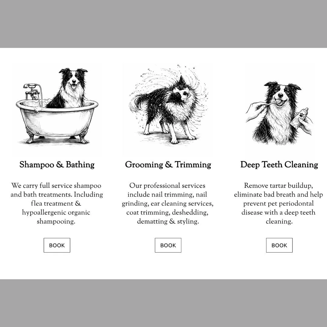
Most dog grooming businesses over-explain their services.
This layout does the opposite:
Break everything into 3 clear categories
Keep descriptions short and readable
Add visual anchors with simple illustrations
Visitors don’t need every detail, they need clarity.
If they have to think too hard, they leave.
Trust Isn’t Built With Words Alone
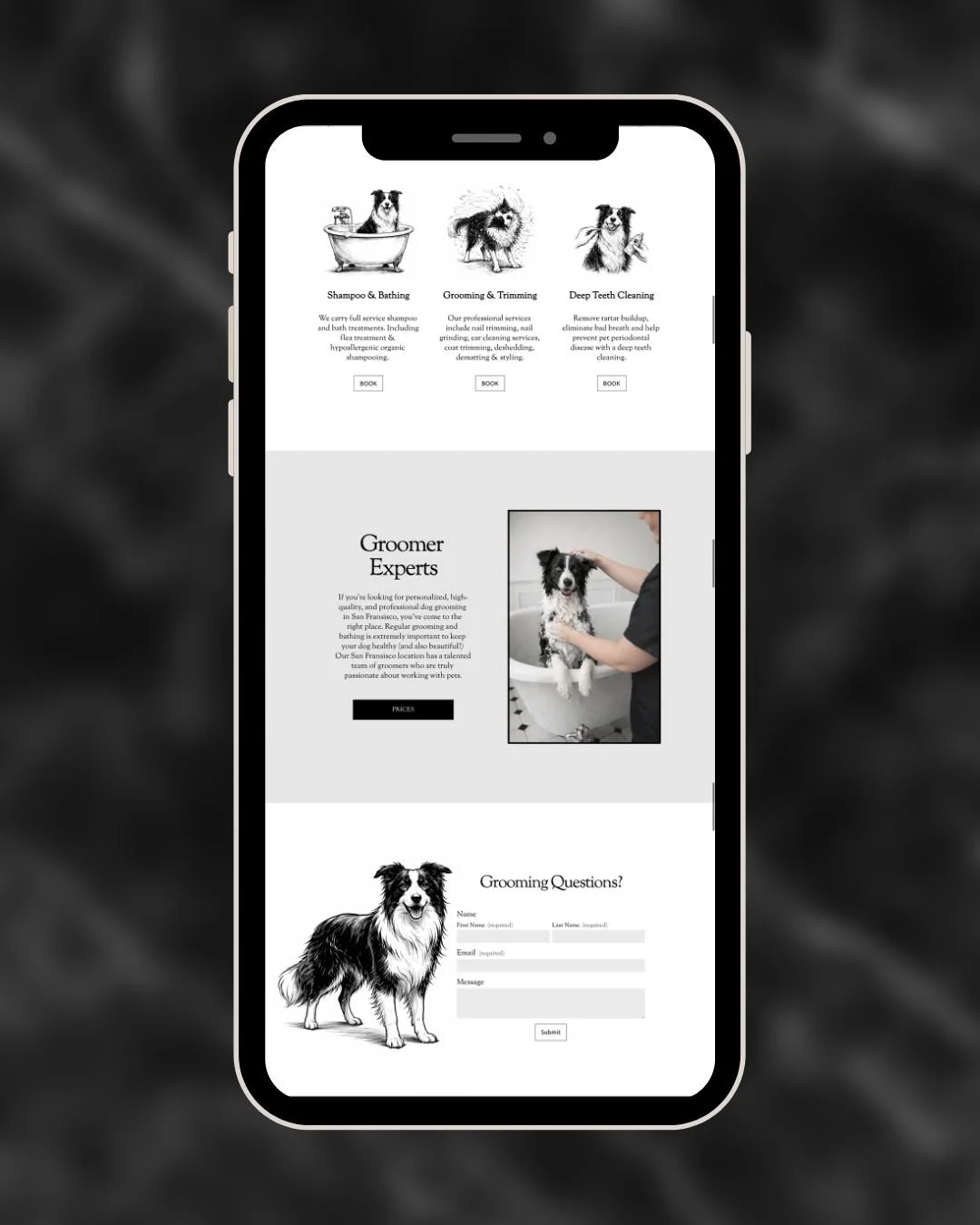
Anyone can say “we care about your dog.”
What actually builds trust:
Clean design
Realistic imagery
Thoughtful spacing
Consistency
The “Groomer Experts” section is intentionally understated.
It doesn’t try to sell, it reassures.
That subtle shift matters.
Because pet owners aren’t just buying grooming, they’re evaluating:
“Would I feel comfortable leaving my dog here?”
Design Controls Perceived Value
This is where most pet care websites fall short.
Two dog grooming businesses can offer the exact same service but:
One looks cheap → attracts price shoppers
One looks premium → attracts higher-value clients
Same service. Completely different customers.
This design leans heavily into:
Serif typography (signals quality)
Neutral tones (signals calm + cleanliness)
Structured spacing (signals professionalism)
All of that quietly tells the user:
“This is a place that takes care seriously.”
The Goal Isn’t More Information, It’s Less Friction
Notice what’s not happening:
No long paragraphs
No overwhelming menus
No complicated booking flow
Instead:
Clear “Book” buttons
A simple contact form
A friendly, approachable tone
Every extra step you remove increases the chance someone actually reaches out.
What This Means for Pet Businesses
If your dog grooming website isn’t converting, it’s usually not because of your service, it’s because of perception.
A few shifts make a huge difference:
Make your site feel clean before anything else
Show the experience, not just the service
Reduce how much users have to think
Let design do the heavy lifting instead of text
Final Thought
A strong pet business website doesn’t try to convince people.
It makes them feel like they’ve already made the right choice.
That’s the difference between someone browsing…
and someone booking.